Redefining a Hindi Primer
Akshar Chitra
With Typecraft Initiative
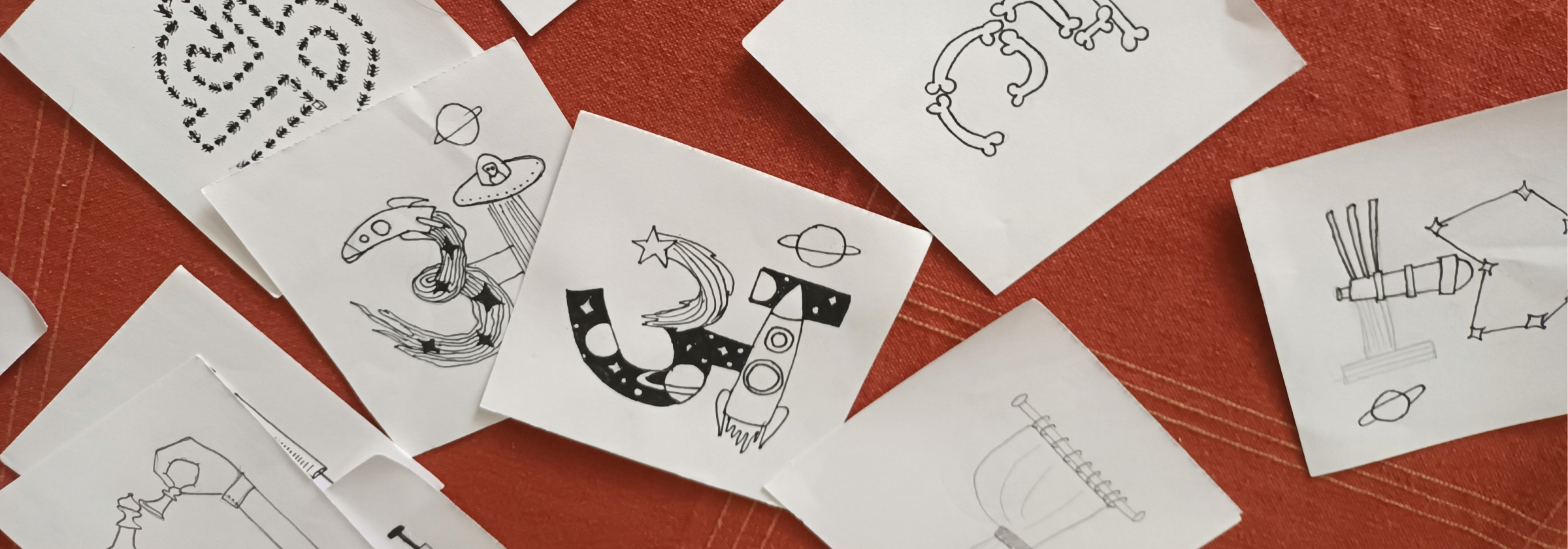
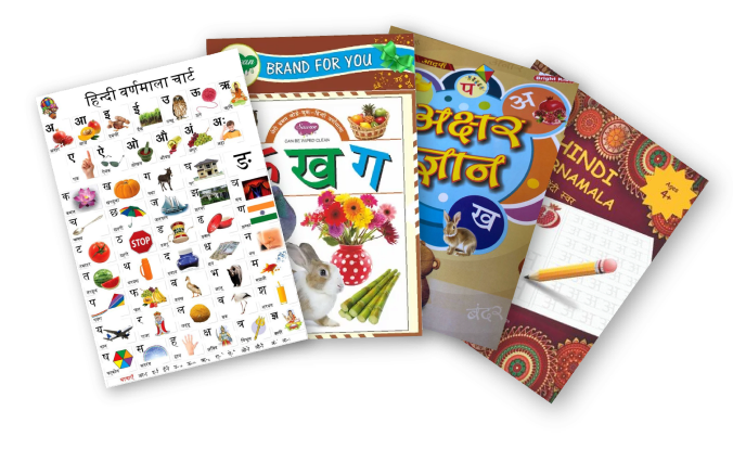
Most children’s primers treat letters and images as neighbors: an 'A' stands next to an Apple. But children recognize objects long before they decode abstract scripts. Akshar-Chitra collapses this distance.
Developed with The Typecraft Initiative, Akshar-Chitra merges Hindi letters with Mithila art illustrations to create a single, intuitive visual unit, culturally grounded and enduring learning experience.
Skills
- Research-driven design
- Illustration & Lettering
- Visual learning aid
Tools


The Typecraft Initiative
Founded by Ishan Khosla, the Typecraft Initiative develops typefaces rooted in craft traditions, translating indigenous visual practices into contemporary design systems. Typecraft’s concept of ‘Akshar Chitra’ extends this approach into early education, bridging typography, craft and learning.
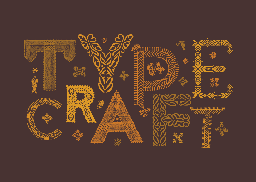
Collaborators & Contributors
Mithila/Madhubani Artists
Pradyumna Kumar

Pushpa Kumari
Hira Kant
Rekha Rani
Design, Research & Development
Ashima Kaushik (me)
Design Advisory (Typecraft)

Ishan Khosla
Shirley Bhatnagar
The Landscape of Existing Tools
Reading requires the synchronization of four neural processors. Traditional Hindi tools often address these in isolation, forcing the child to perform the heavy lifting of integration.
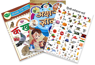
- Flashcards & Rote Charts
Prioritize the Orthographic Processor (Letter Memory). Letters remain abstract shapes, often failing to trigger meaningful conceptual links. - Picture Books
Stimulate the Meaning Processor (Vocabulary) but separate the image from the letter, creating a "split-attention effect" that weakens phonemic connection. - Rhymes & Drills
Engage the Phonological Processor (Speech-Sound) but lack a stable visual anchor.
4-Step Learning Process
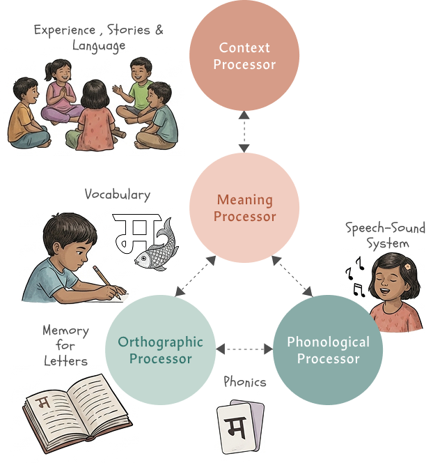
Children recognise images before they read letters. What if letters looked like what children already recognize?
By using Integrated Picture Mnemonics in Akshar Chitra, we create a simultaneous fire across all neural processors.
Context & Meaning
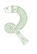
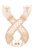
They recognize the familiar 'Machhli' (Fish)
Orthographic
The child sees the skeleton of the letter 'म'
Phonological
The visual of the fish triggers the sound 'म /Ma' instantly
Process and Project Approach
Vocabulary Mapping & Research
Audited standard varnamala primers to identify a filtered list of familiar, concrete nouns.
Through informal testing, I confirmed which objects children recognized, ensuring the vocabulary was grounded in their daily environment.
Establishing Illustration Logic
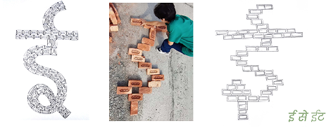
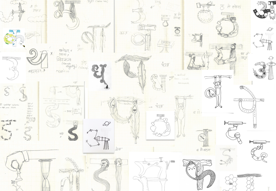
The challenge was merging object shapes with letterforms without compromising legibility. We established a rule: letterform clarity always came first.
This led to the construction logics: Repetition, Shape-based, Controlled Abstraction and Hybrid.
Artisan Collaboration
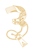
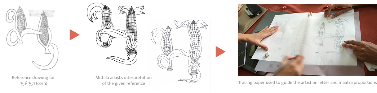
Working with Mithila artists required aligning two distinct visual systems: Letterform proportions and Madhubani art style.
I provided rough sketches, proportion guides and letter skeletons to help the artists maintain the functional integrity of the letters while preserving authenticity.
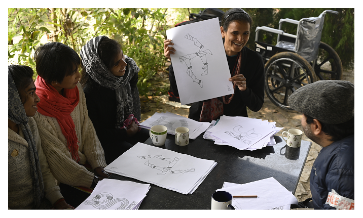
Classroom Validation
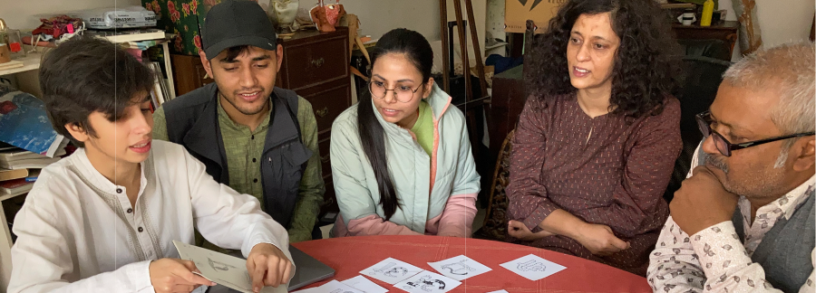
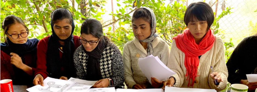
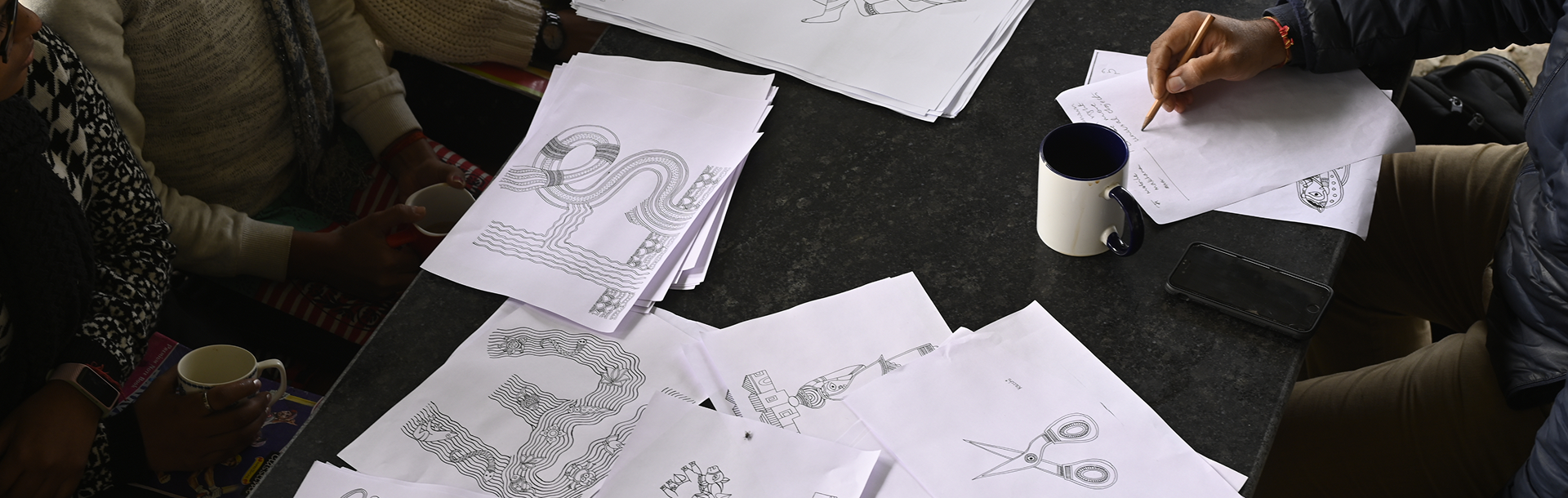
As the system evolved, we returned to the classroom. Feedback from educators and primary learners helped us refine ambiguous illustrations to ensure recognition worked effectively in monochrome, urban and rural contexts.
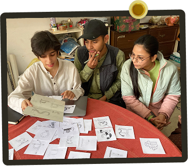
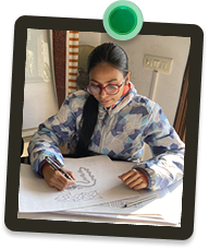
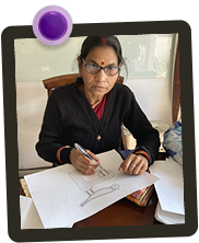
Establishing Illustration Logic
There was no universal formula for building the letters. Even though four broad approaches were defined, each letter became its own puzzle with a new set of decisions.
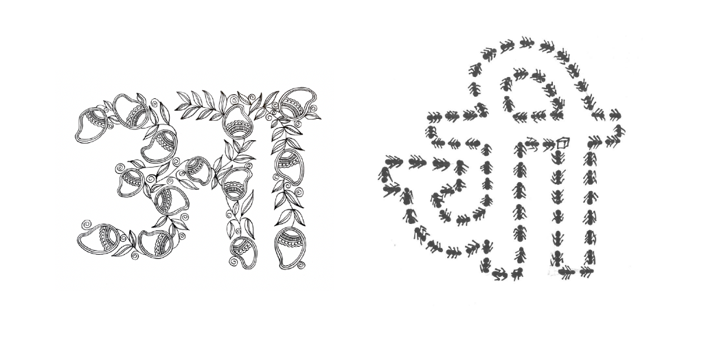
Repetition & Arrangement
Objects repeated and arranged to create the letter. Example: आम (mango) or चींटी (ants) — multiple objects lined up or stacked to spell out the letter.
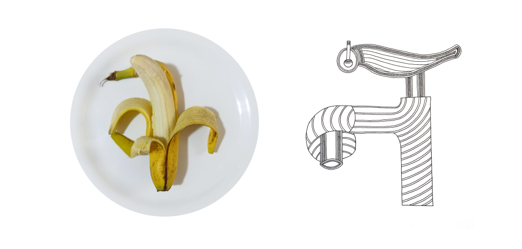
Object Shaping
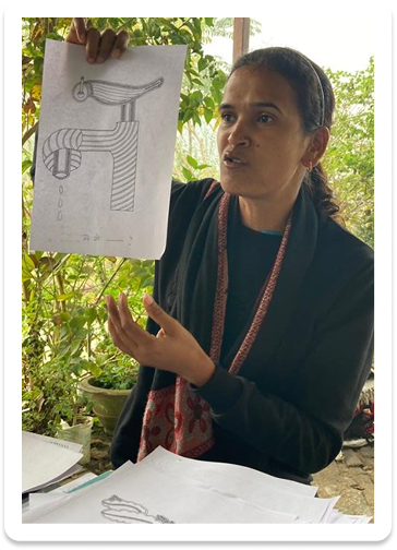
Single/multiple objects shaped to naturally form the letter. Example: केला (banana) or नल (tap) — the object's form with very little abstraction suggests the letter.
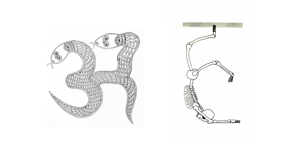
Abstraction & Bending
Objects abstracted and bent to fit the letterform. Example: अजगर (python) or हड्डी (bone)
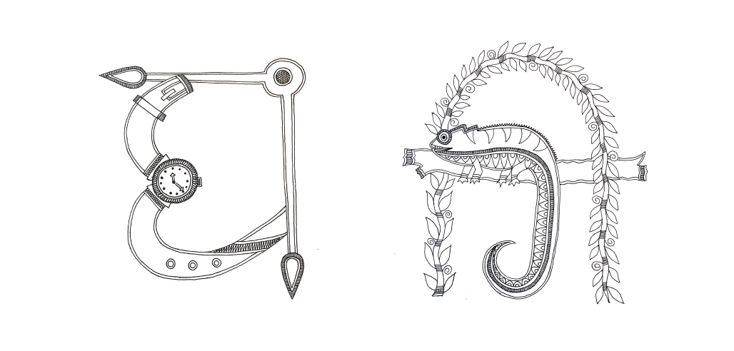
Hybrid Approach
Combination of techniques to ensure optimal legibility and visual interest. Example: घड़ी (watch/clock) or गिरगिट (chameleon)
Insights from Teachers and Learners
Teachers emphasized that clarity stems from objects that children see, use or talk about naturally (concrete nouns). Such words anchor the letterform better than uncommon or abstract concepts like भगवान (god).
- से 'मोबाइल'
- से 'मखाना'
- से 'मछली'
While "Mobile" is universal, it is a transliterated. "Makhana" (Fox Nut) was regionally specific but difficult to identify without color.
The Solution: Chose "Machhli" (Fish); it provided the strongest silhouette for monochrome recognition and offered the most scope for storytelling across rural and urban contexts.
Pedagogy in Practice
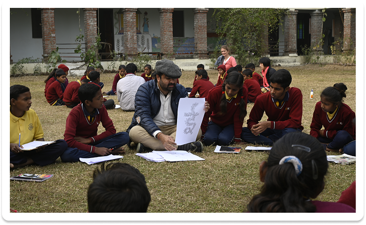
Beyond simple identification & vocabulary building, educators used the illustrations as narrative prompts. This confirmed that instead of positioning as a children’s book, it should be a teaching aid.
Also got insights about which illustrations to replace
- where similar line drawings caused confusion (like Sugarcane vs. Bamboo).
- illustrations are not recognizable
- outdated or irrelevant words (like दवात i.e. inkpot)
Updated Positioning
Design Constraints & Key Decisions
Craft vs. Structure
The Mithila artists’ instinct was to prioritize the organic-ness of the art. My role was to act as the typographic anchor by providing proportion guides and letter skeletons to ensure the intricate decorative motifs affect a letter’s legibility.
The Maatra Problem
Integrating illustrations into letters like 'भ' or 'ध' is already complex; adding vowel signs (maatras) often cluttered the illustration into illegibility. Example: भु से भुट्टा (corn)
The Colour Dependency
The aid was designed for low-cost, high-contrast photocopying (more accessible). But in a monochrome, line-art system, objects like a गाजर (carrot) and a मूली (radish) are visually identical. So we had to eliminate vocabulary that relied on colour for recognition.
Ensuring Accessibility Across Classroom Conditions
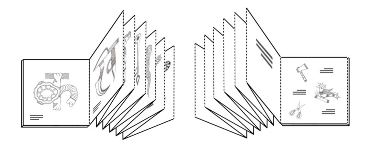
Exploring formats like tearaway sheets, perforated pages, and wall charts helped understand how the teaching aid might function in different settings.
Why This Matters?
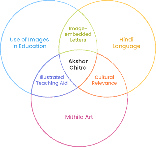
Akshar-Chitra isn't just a teaching aid. It's a case study in how design can bridge multiple disciplines like typography, pedagogy, anthropology, craft and social impact. It demonstrates that the most meaningful design work happens at the intersection of research, culture and real-world problems.
For Craftspeople
Increased awareness of how traditional crafts can be transformed through design. Gaining exposure to new markets and new ways of thinking about their work.
For Educators & Students
Teachers discovered a tool that sparks conversation and engagement, with children. Older students found creative challenge in drawing letters from objects.
For Designers
This project demonstrates that graphic design can operate at the intersection of education, culture, craft and social impact.