Brand Extension
Air India
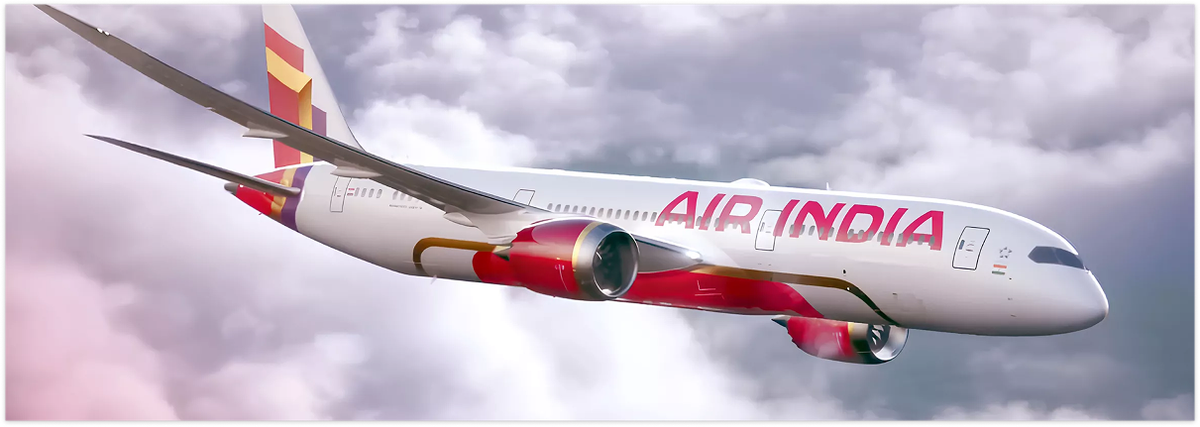
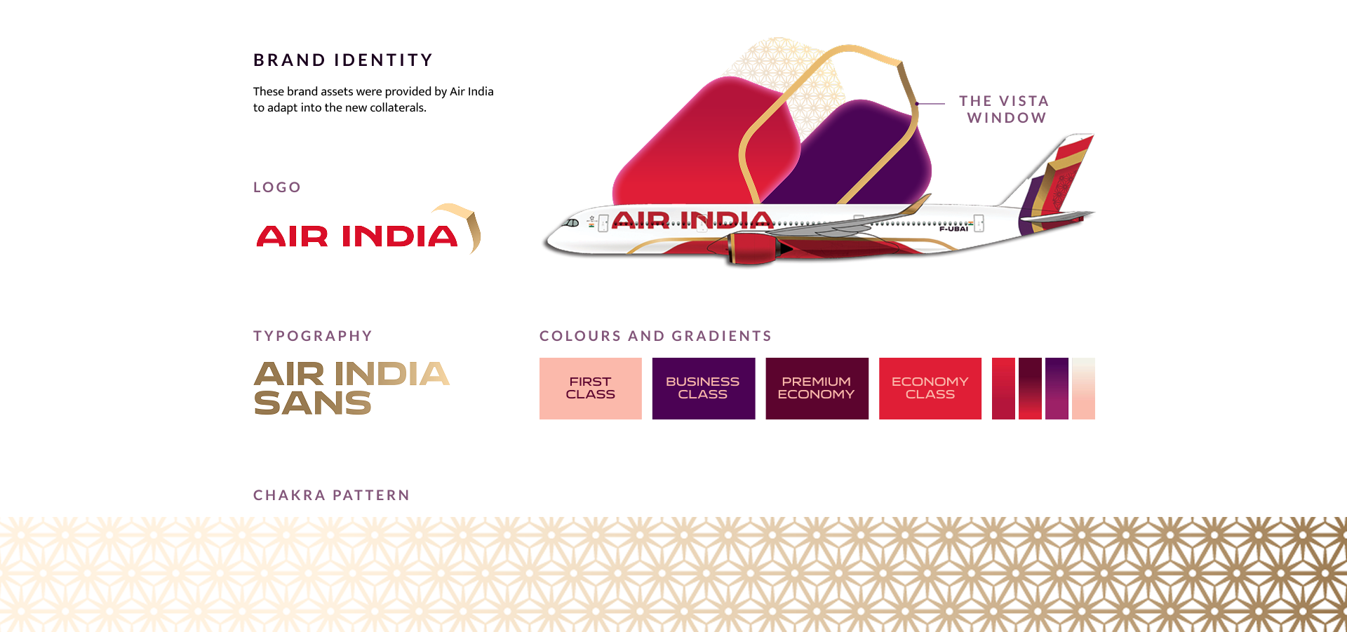
Following its acquisition by the Tata Group, Air India unveiled a new global brand identity to mark its transformation into a premium private airline.
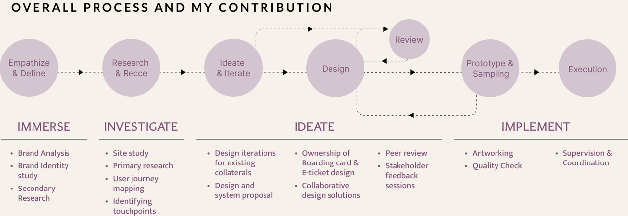
My role focused on scaling the identity into a global design system, redefining the passenger experience and brand visibility across 83+ airports. The primary challenge lay in implementing this vision across a diverse physical infrastructure under a stringent 4 month timeline.
Skills
- Systems thinking
- Brand translation across print and digital medium
Tools



Research & Discovery
Mapped the end-to-end passenger journey through airport recce,
stakeholder interviews, competitor benchmarking, and touchpoint
analysis to identify experience gaps and opportunities.
Challenges
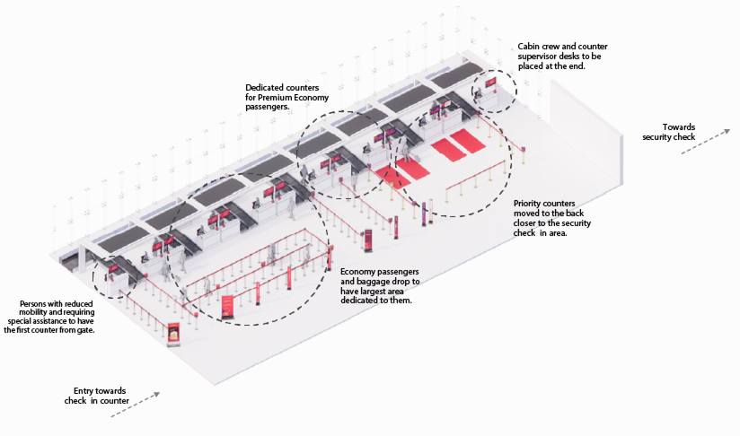
- Significant variation in airport layouts, infrastructure and
constraints (domestic & international) - Limited flexibility due to rules governed by the airport authority
- Creating design guidelines for omni-channel touchpoints
- Coordinating across teams, vendors, and locations (remote and
on-ground)
Opportunity Mapping
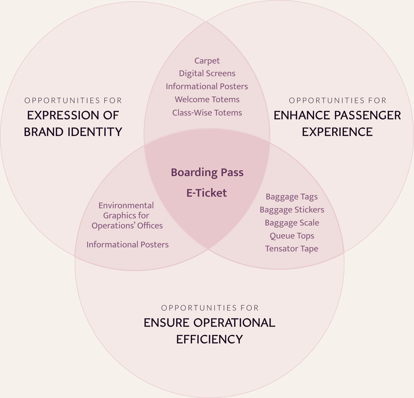
Each touchpoint was evaluated across 3 strategic objectives:
- strengthening the brand
- improving passenger experience
- supporting operational efficiency
This framework helped prioritize where design could create the greatest impact.
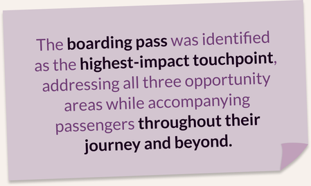
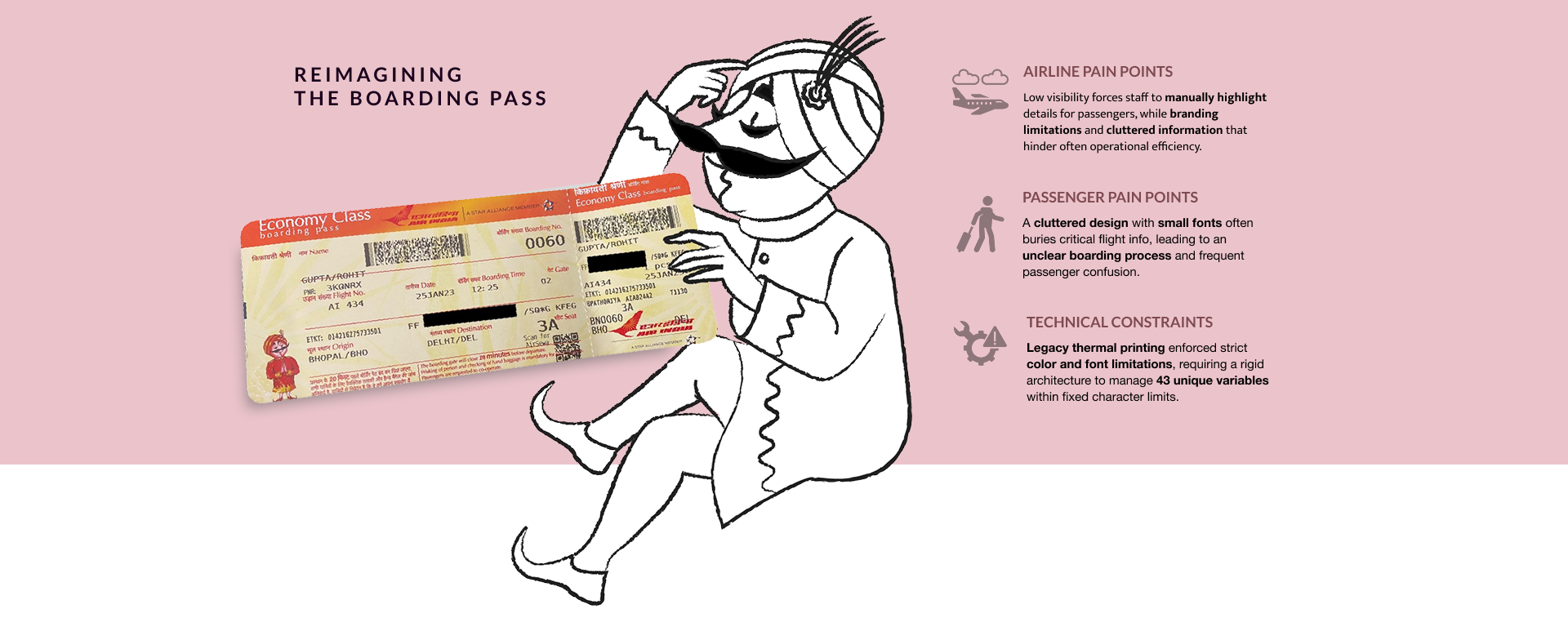
Reimagining the Boarding Pass
Designing with Purpose
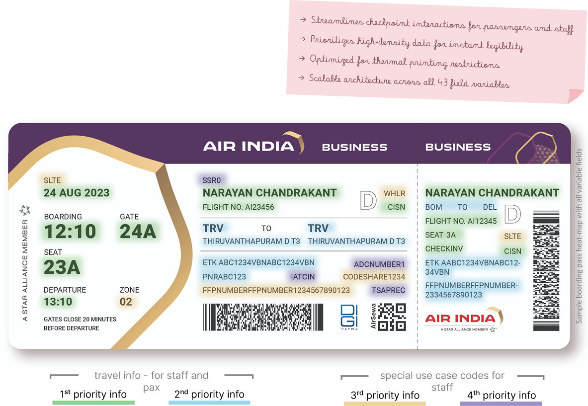
Close collaboration with airline staff and user testing provided
valuable insights into their specific needs and priorities to
determine the information priority mapping.
Design shortlisted for
Manual Check-in Counters
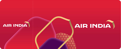
Pre-printed cardstock to provide a tangible and branded passenger experience, from the beginning of the journey and beyond.
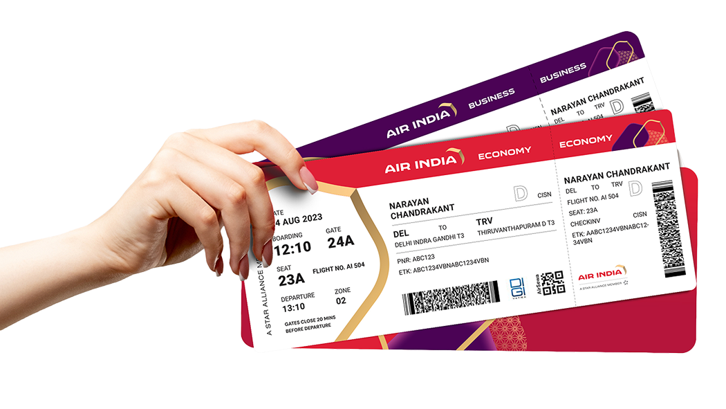
Features
Centralized Brand Integration
Successfully integrated the "Vista" window frame as a core structural element, ensuring a cohesive connection to the new global identity.
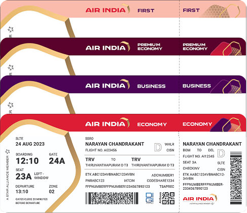
Colour Coding for classes
Implemented a distinct color-coding system to facilitate seamless cabin class differentiation.
Operational Balance
Refined the information architecture to create an intuitive interface that reduces friction at high-traffic security and boarding checkpoints.
Strategic Information Hierarchy
Prioritizes gate, seat, and flight details within the "Vista" frame for instant, high-visibility recognition.

Campbell Wilson
CEO, MD of Air India
The boarding pass design was a key highlight of thebrand extension. It sets a solid standard for clarityand brand alignment in our passenger experience.

Designed all touchpoints
for 83+ airports
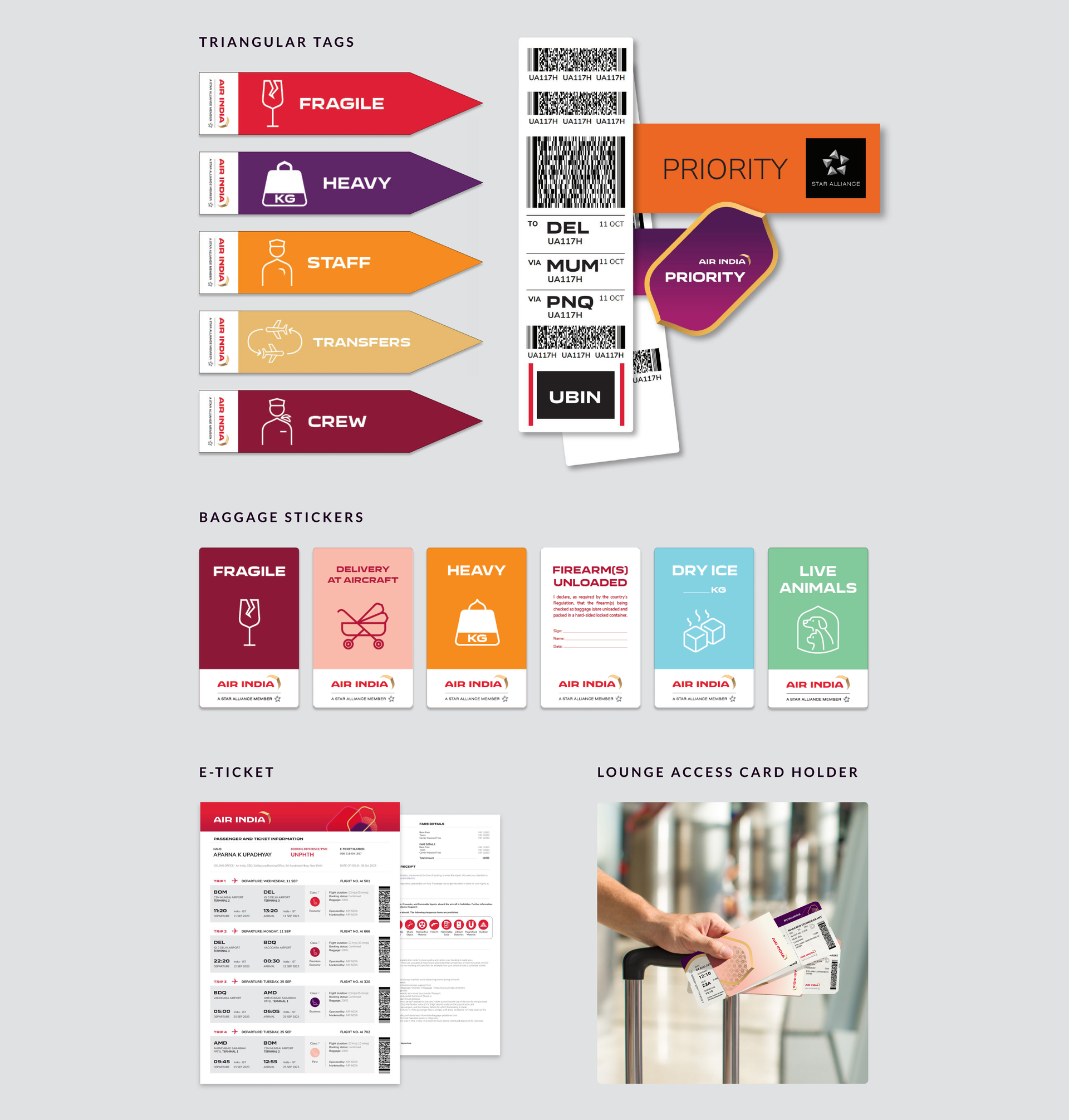
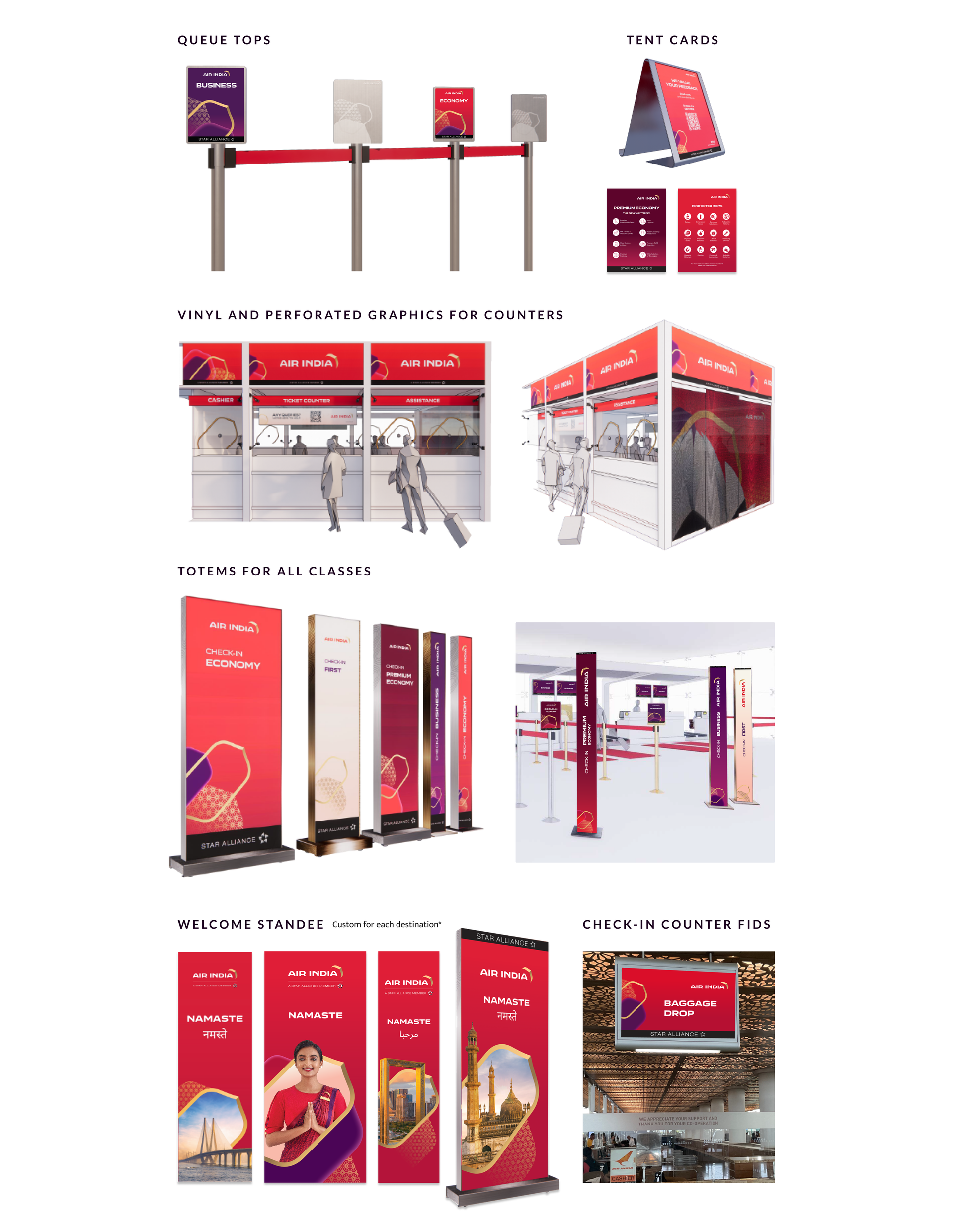
To ensure a seamless brand experience, the new visual
identity was mapped across all passenger touchpoints.
Each touchpoint posed unique challenges, requiring
focused attention and tailored solutions.
~72,000 passengers
interact with these touchpoints everyday
reiterating the new identity and improving
their journey, since January 2024.