Rebranding
Indraprastha Gas Limited
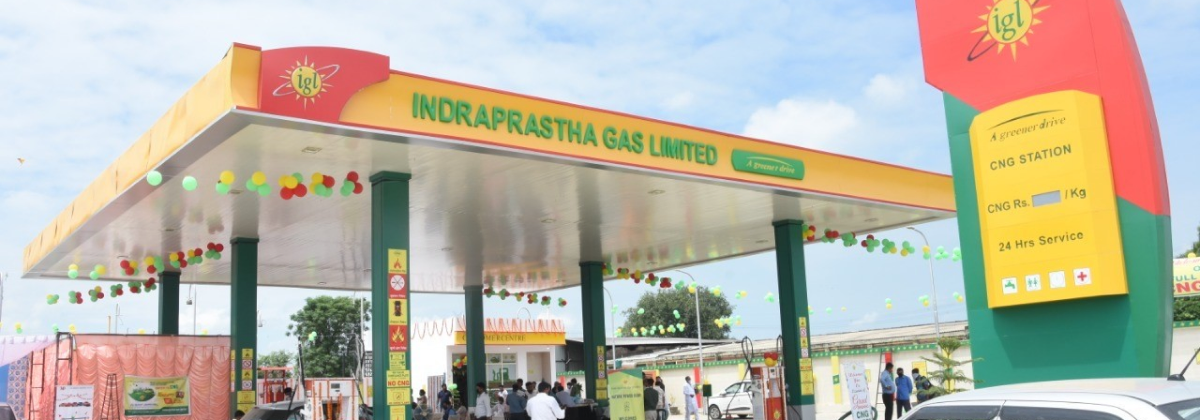
Indraprastha Gas Limited (IGL), a legacy brand in natural gas distribution, stood at a point of transition. With leadership change and plans for expansion, its existing visual identity no longer reflected where the company was headed.
The challenge was to modernize the brand while retaining the trust it had built over decades.
Skills
- Visual Identity Systems
- Brand Strategy
Tools

The Brand Then
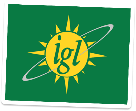
The existing identity centered around a sun and orbital ring—symbolizing energy, continuity, and movement.
- Conceptually strong
- But the execution feels dated
- Strong recall but outdated perception
- Static and stagnant identity
Problem statement
Despite a period of rapid growth and strategic transition, IGL's current visual identity feels outdated and stagnant. This prevents the brand from being perceived as a modern, forward-thinking energy leader, making it difficult to align with evolving consumer expectations.
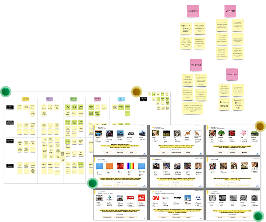
Stakeholder Workshop
To align the identity with IGL’s future, we conducted stakeholder workshops across leadership and teams.
- Brand reflection: what defines IGL today
- Future visioning: where the brand is headed
- Values & personality: how it should be perceived
- Customer journey mapping: key touchpoints and gaps
Big Insights
The insights from stakeholders and brand analysis were distilled into a set of guiding principles—defining how IGL should be perceived moving forward. These principles shaped not just the visual identity, but the tone, behaviour and overall brand expression.

Reliable Infrastructure
A brand built on scale, strength, and consistency.
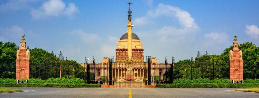
Seamless Continuity
Ensuring uninterrupted, everyday access to energy.

Progressive Technology
Signaling innovation and forward movement.
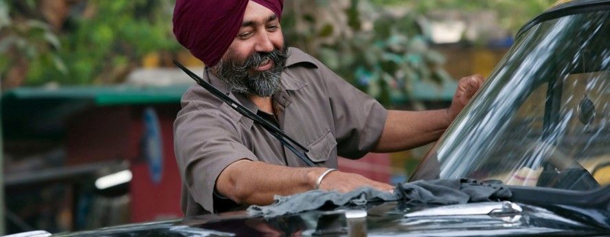
Customer-Centric Approach
Making the brand more human, accessible and relatable.
The insights translated into a unified brand code. It aligned what IGL stands for with how it shows up through a core concept.
Core concept
Powering dreams
Values
- Pioneer
- Excellence
- Accessible
- User-centric
Positioning
A green energy solutions provider that is accessible and reliable, delivering seamless and convenient experiences for the evolving customer. An integral part of everyday life: powering people and the nation toward a greener future.
Brand Ambition
To celebrate IGL’s legacy while extending its impact across the nation and beyond. To build a brand that enables India’s transition to a sustainable future—supporting everyday aspirations and powering collective progress.
Personality
- Approachable
- Sincere
- Optimistic
- Dynamic

Primary Archetype
The Everyman
- A brand that is inclusive
- That celebrates the beauty of everyday life and individual aspirants
- Fosters a sense of belonging
- Trustworthy and dependable
- Shares the enthusiasm and passion of people

Secondary Archetype
The Explorer
- In pursuit of innovation and driven by ambition
- Always pushing boundaries
- Curious to explore uncharted territories
From Strategy to Design
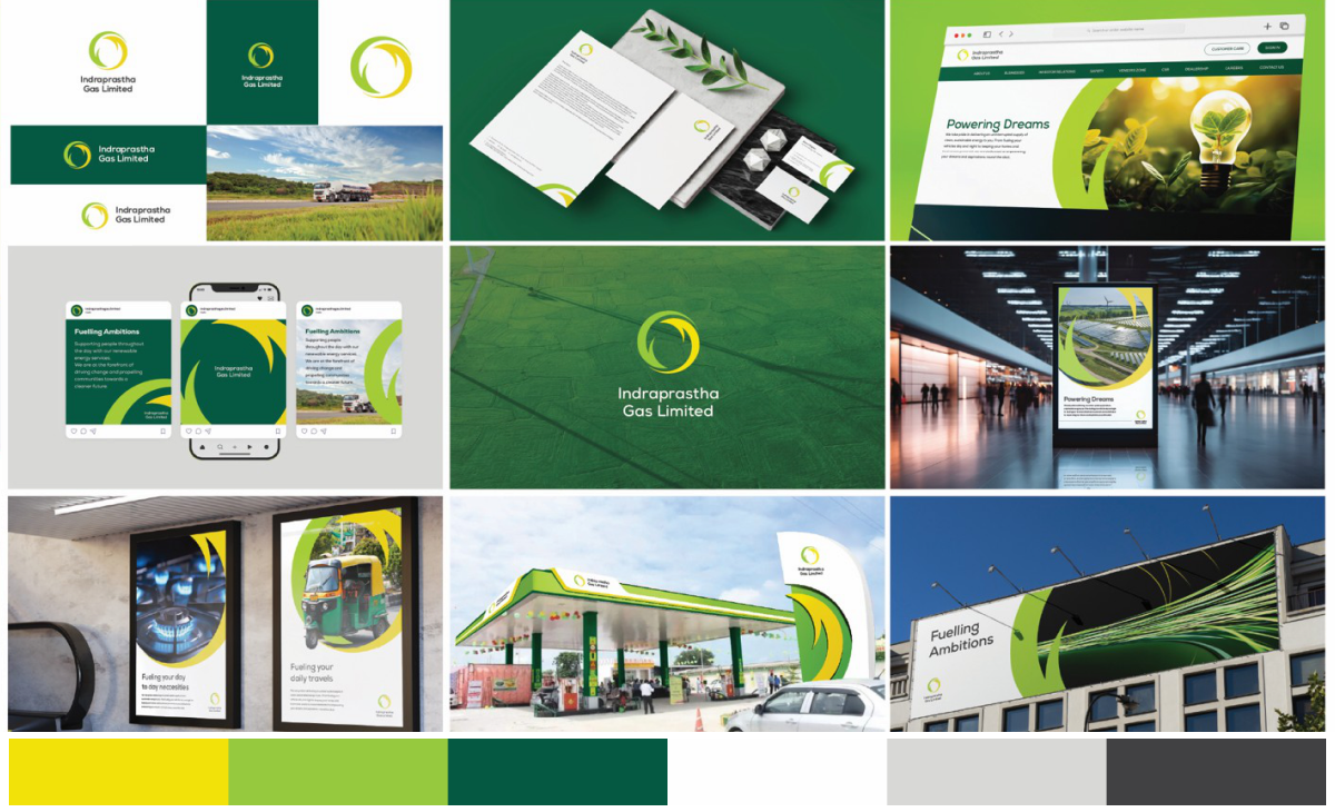
To understand how far the identity could evolve, multiple directions were developed; each representing insights from earlier research.
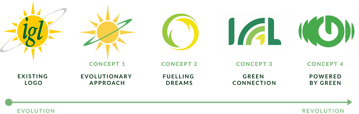
Concept 1
Evolutionary Approach
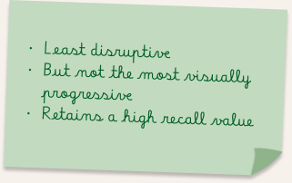
An evolution of IGL’s existing identity, retaining the sun as a symbol of energy while refining form and clarity for a more contemporary expression. The orbital ring reinforces continuity, reliability and approachability.
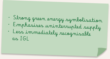
Concept 2
Fuelling Dreams
A dynamic circular form representing the continuous flow and renewal of energy across users and systems. The looping arrows emphasize sustainability, movement and the perpetual supply of IGL.
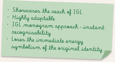
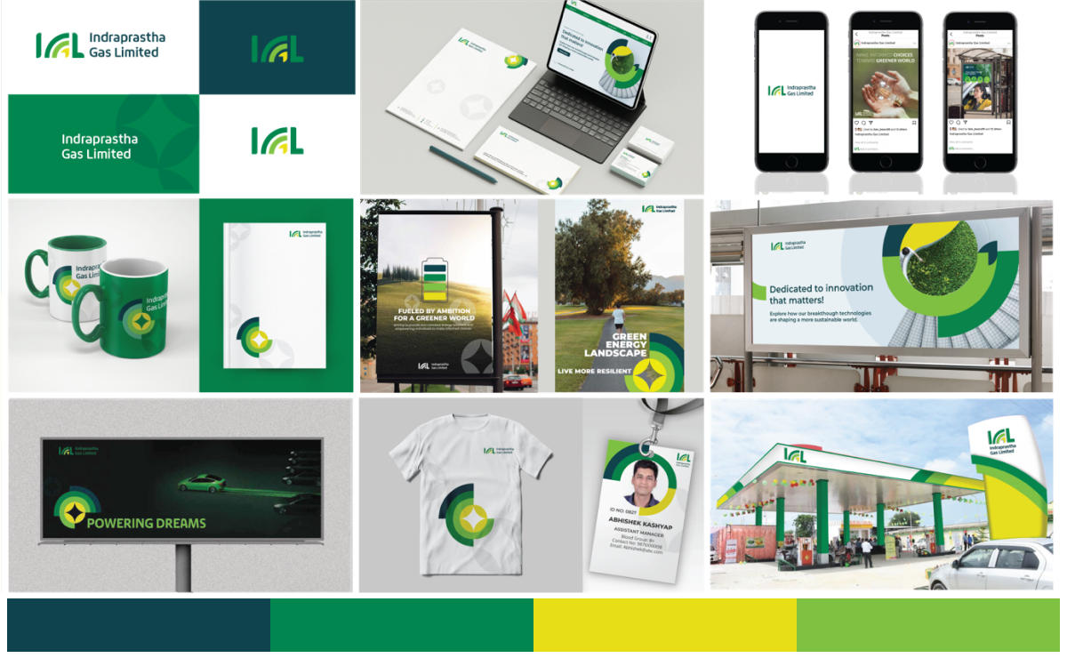
Concept 3
Your Green Connection
A typographic approach that simplifies the identity into a bold, modern IGL monogram. The form reflects growth and reach of green energy solutions of IGL.
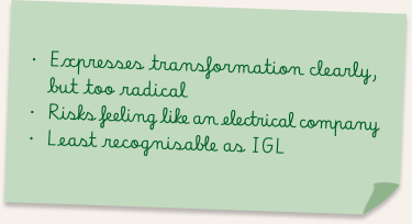
Concept 4
Powered by Green
A power-inspired symbol representing the shift toward cleaner, user-driven energy solutions. Shifts the identity toward a more contemporary and tech-led visual language.
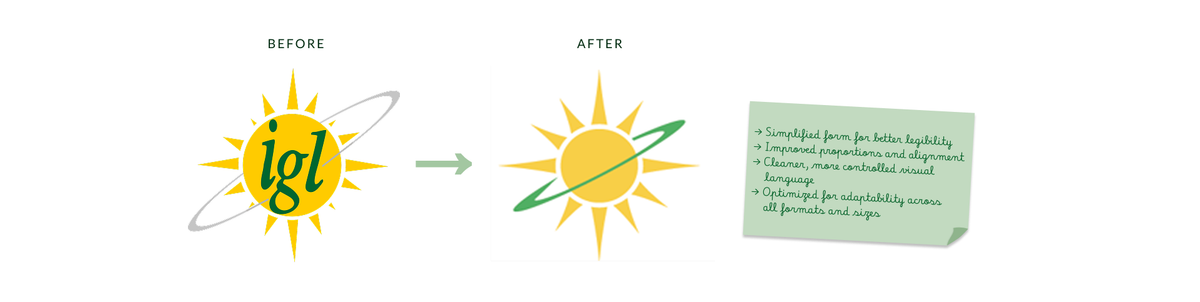
Arriving at the Right Balance
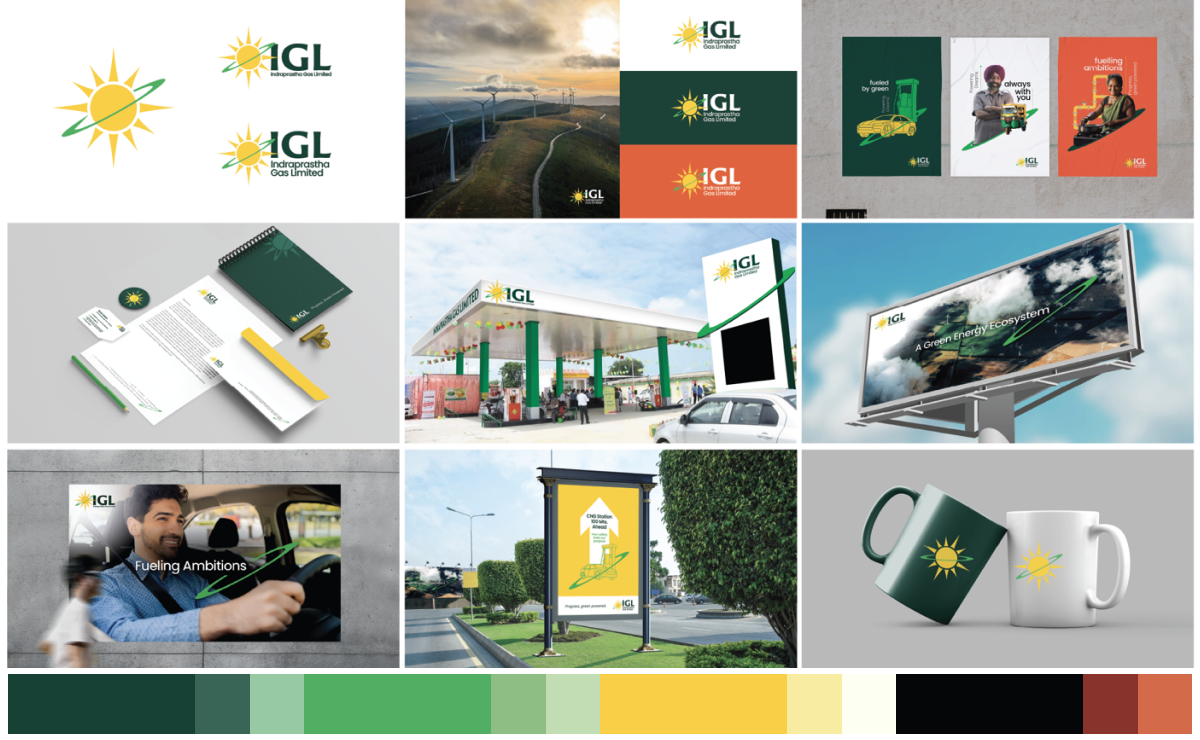
The selected direction focused on refining the existing identity; to balance familiarity with a more contemporary expression because radical shifts weakened brand recall.
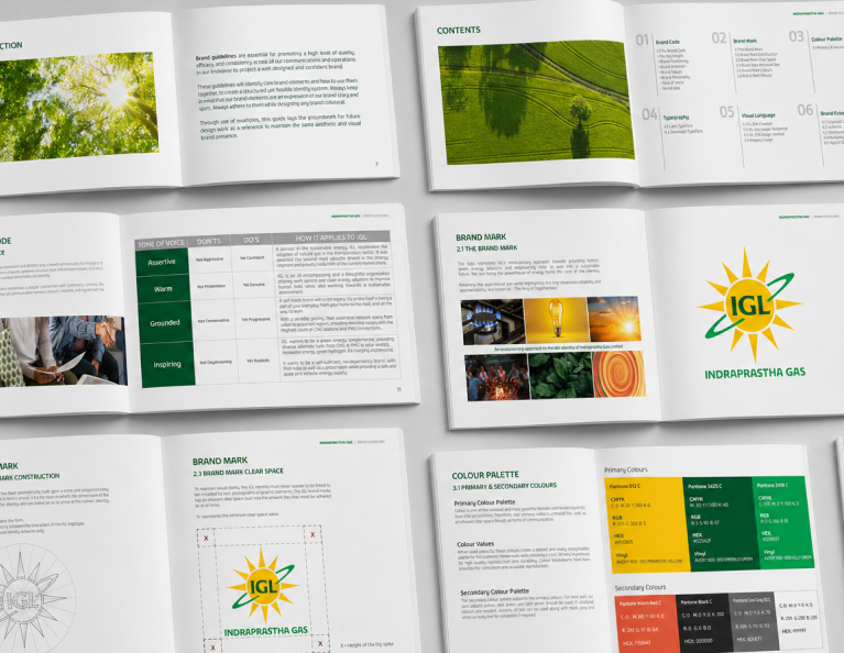
Brand Guidelines
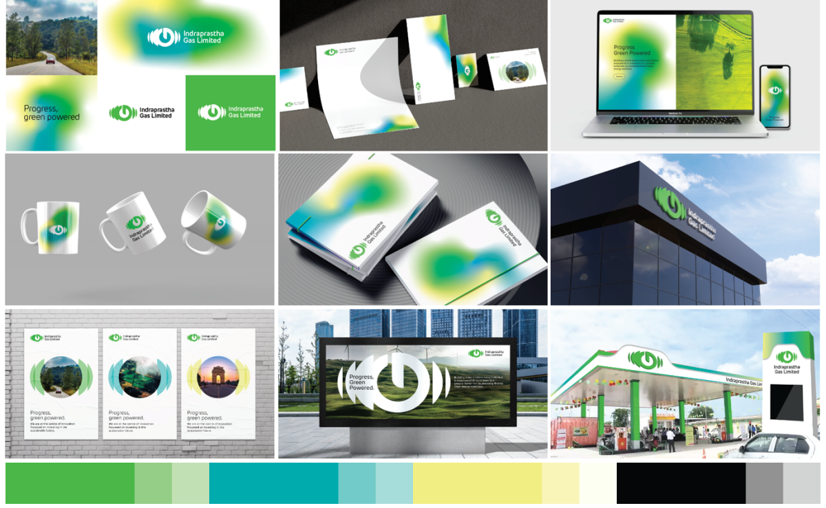
The challenge wasn’t just to design a visual identity, it was to create clarity around what the brand stands for and how it should consistently express itself across every touchpoint.
I approached this by defining a Brand Code, a foundational layer that brings together the brand under one cohesive framework. At the core of this system sits the brand idea:
“Powering dreams”