Logo Design
Maahi
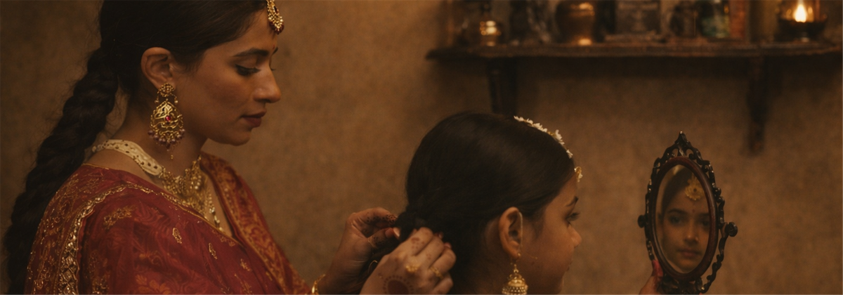
A mark shaped by ritual, memory, and making, for a bridalwear brand rooted in craft and continuity.
Maahi is an upcoming homegrown bridalwear brand based in Jaipur that reworks tradition into something deeply personal. From heirloom sarees to inherited textiles, pieces are transformed so brides can carry their history into new beginnings.
Skills
- Brand identity development
- Narrative-driven design
Tools

Concept Drivers
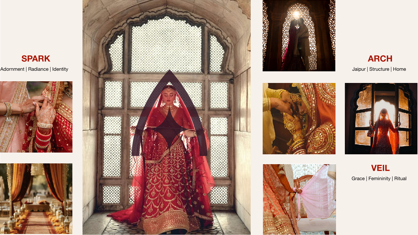
Three ideas shaped the mark: adornment, structure, and ritual; drawn from Jaipur’s architecture and bridal tradition.
Logotype
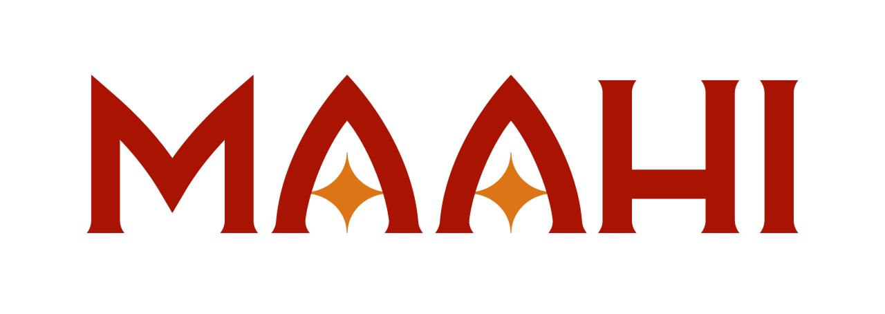
- The bold arched letterforms draw inspiration from Indian architectural motifs (mandaps and jharokas) and bridal veils.
- The combination of bold and serif lettering creates a balance of strength and grace, just like Maahi, the brand.
- Custom serif to convey elegance and premium-ness of the brand, anchoring it in timeless heirloom couture.
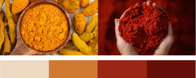
- The deep red and burnt orange tones are directly inspired by haldi-kumkum rituals, echoing the cultural richness of Indian weddings.

Brand Guidelines
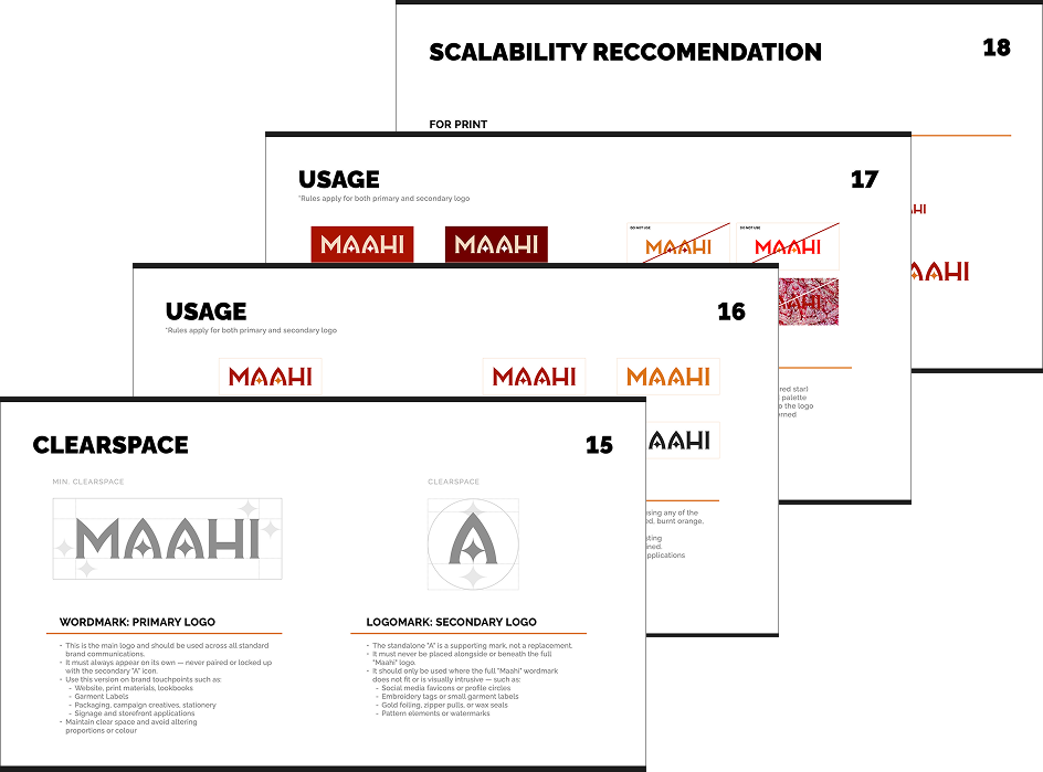
Developed and delivered a comprehensive brand guideline deck for Maahi, outlining the correct usage of the primary wordmark and secondary logomark across print and digital touchpoints. The document defined clear rules for logo hierarchy, colour applications, clear space, scalability and contextual usage on varied backgrounds. It also included practical guidance for real-world applications such as packaging, garment labels, embroidery, web, and signage to ensure consistency.